Decode Data With Google Analytics Reporting Tool
Browsing through raw data is daunting — but it doesn't need to be.
Using a Google Analytics Reporting Tool, you have a robust, simple-to-use dashboard that converts your Google Analytics data into efficient, actionable visuals. Whether monitoring performance, calculating ROI, or delivering client reports, ourGoogle Analytics report generator makes it easier so that you can concentrate on what matters.
Google Analytics Reports Matter to Every Business
Turn Traffic into Insight—And Insight into Action
Keep an eye on each touchpoint, from the initial click until the conversion. Our platform gives you a funnel view of customer behavior by syncing with Google Analytics.
DM Cockpit Google Analytics Reporting Tool: How to Use
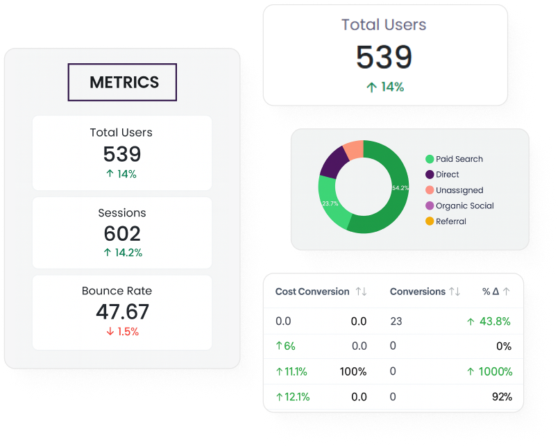
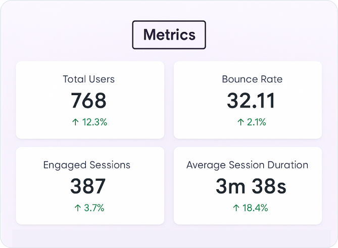
Metrics Dashboard –
Your Single Stop Summary
The Metrics Dashboard provides a live snapshot of your most important website metrics, including users, sessions, bounce rate, engagement time, and so on.
The Metrics Dashboard provides a live snapshot of your most important website metrics, including users, sessions, bounce rate, engagement time, and so on.
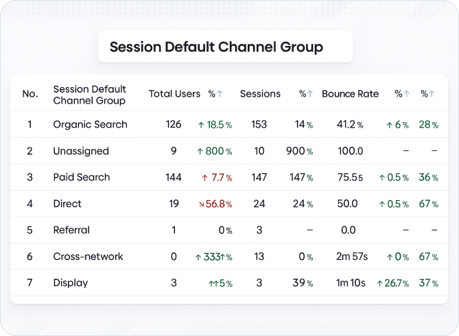
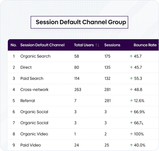
Session Channel –
Understand Your User Source
Sort incoming sessions by default channel groups, including organic, paid, direct, referral, email, and so on.
Select your reporting period and view the visual chart, which segments your sessions by channel. Study patterns and adjust your strategy according to top-performing sources.
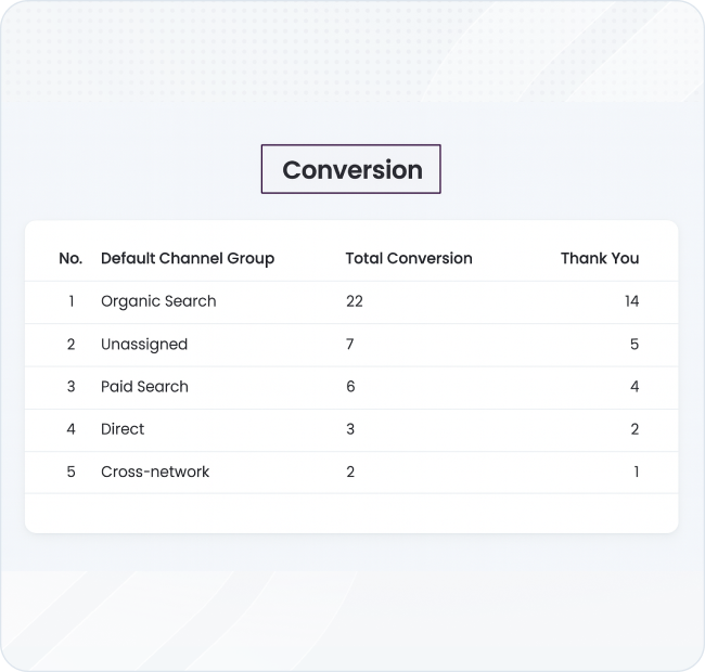
Conversion Pie Chart –
What's Driving Results
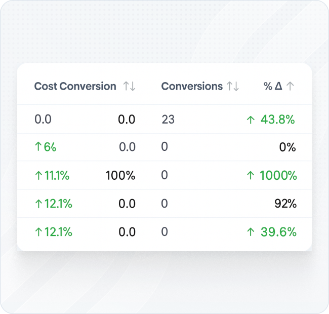
Conversion information tends to become lost in spreadsheets. The Conversion Pie Chart in our Google Analytics report generator clarifies things by indicating which channels, campaigns, or user actions are converting best.
Click into the Conversion part of the report to see pie chart breakdowns by goal type or traffic channel. Use to identify organic search, paid search, referral, organic social media, cross-network, and so on.
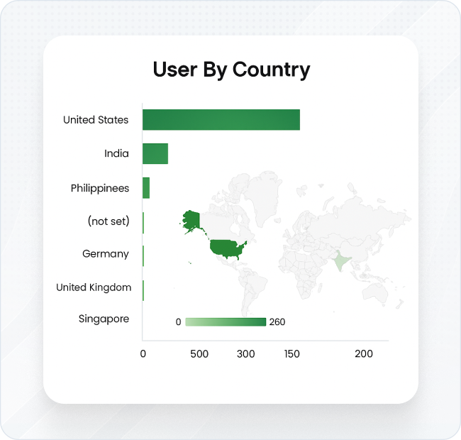
Detect Users by Country –
Your Global Reach
Regional insights enable you to see the origin of your visitors and the way they behave on your website. The chart for Users by Country displays relative regional traffic levels, session duration, and bounce rate, enabling you to target location-based campaigns.
Swipe to the geo-visualisation screen. Move the cursor over individual countries or inspect the list view to monitor numbers and activity for each region.
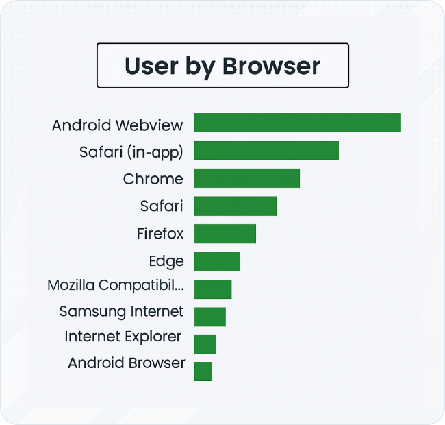
Device and Browser Details –
Optimize User Experience
Today’s users access websites across a variety of devices and browsers. This feature compares performance metrics for mobile, tablet, and desktop users, as well as browser-specific usage data.
Switch between mobile and desktop views to compare user behaviour. Use these comparisons to identify optimization opportunities or detect technical issues.
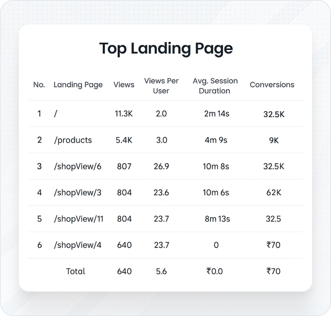
Top Landing Pages –
What Engages Your Audience
The initial page a user views often makes them stay or bounce. This tool displays your most-visited landing pages, complete with engagement metrics such as bounce rate, session duration, and conversions.
In the Landing Pages report, check performance metrics for every top-entry page. See what content works for your audience— and what requires rewriting.
Session Source List –
Identify Traffic Sources
Aside from channel grouping, this list shows the specific source of every session. Whether visitors came from Google, Facebook, a newsletter, or a niche blog, this segmentation is crucial for detailed tracking.
Go to the Session Source area and sort by medium, campaign name, or URL parameters to see how each source drives traffic to your site.
Google Ads Campaign List –
Track Paid Campaign Success
See a standalone view of your Google Ads campaigns, including impressions, clicks, conversions, and return on ad spend (ROAS). It's an essential tool to manage pay-per-click ad campaigns and coordinate ad spend with business results.
Link your Google Ads account via DM Cockpit. After linking, go to the Campaign List section to monitor and compare campaign performance in real-time.
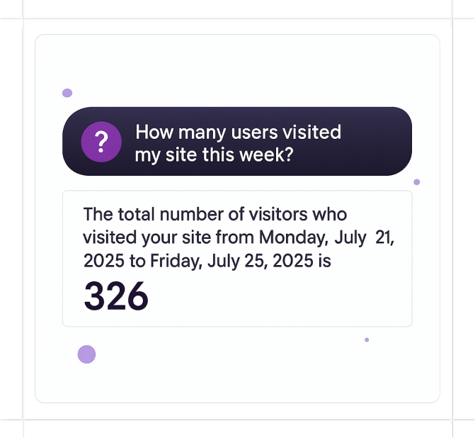
Google Analytics Report in Seconds, Not Minutes
- With DM Captain
Join DM Cockpit and use DM Captain to retrieve data, create reports, or simply ask questions while skipping the boring research.
Use DM Cockpit for Analytics and Beyond
Our Google Analytics Reporting Tool is just one component of a powerful suite that's meant to enable data-driven marketing teams and agencies. With an easy-to-use interface, automatic updates, and customisable reporting, it's designed to scale with your objectives. Unlike cluttered dashboards or overly complicated software, our Google Analytics report generator provides live clarity with no clutter. All your most important metrics are gathered, sorted, and visualized with no learning curve.